Abra Logo
More Storage with less energy
More Storage with less energy

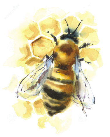
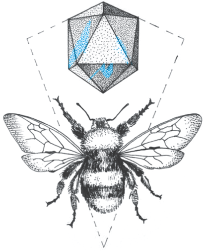
That’s what the logo is. Like a honey comb. But bearing in the middle, a cube that is either a protrusion or a depression as in an optical illusion. The encased cube in all the dimension carries deeper space while hexagon encasing it is the ultimate in space management. Maximum space at minimum cost. Look at the honey comb.
Creating beeswax is a fairly expensive process for the bee, as they consume eight ounces of honey for every one ounce of wax they create. For this reason, they need to make sure that they aren’t wasting resources when creating the structures that will house nectar and honey. The secret is in the geometry of the structures. Bees are extremely brilliant mathematicians. Over their evolutionary history, they have mastered the art of storing the most amount of honey while using the  least amount of resources. The secret behind this efficient honeycomb is due to its hexagonal shape.
Not just the basic six-sided hexagon. Real "perfect" hexagons, meaning all six sides are of equal length. They go for the jewelers' version — precise, just so. Why?
Bees want a tight, secure storage structure that is as simple to build as possible.
Charles Darwin himself once wrote, the
honeycomb is a masterpiece of engineering. It is "absolutely perfect in economizing labor and wax.
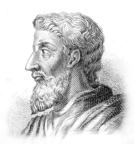
The Abra logo thus is conceived in the same line as a hexagonal encasement for a 3 dimensional embryo. Visualised in the “The honeycomb conjecture”, a contribution made by Marcus Terentius Varro, a Roman scholar in 36 BC, nearly 2000 years before.
The Honeycomb Conjecture, since is known to be a system by which scientists viewed and anlaysed nature. Unlocking Nature in a mathematical methodology.
As designer for Abra knew, Bees too knew, maybe, that they had 3 geometrical figures with equal sides that can fit together on a flat surface without leaving gaps: equilateral triangles, squares and hexagons. So which to choose? The triangle? The square? Or the hexagon? Which one is best?
Here's where the Roman, Marcus Terentius Varro made his great contribution. His "conjecture", and that's what it was, a mathematical guess. A structure built from hexagons is

probably a bit more compact than a structure built from squares or triangles. A hexagon has "the smallest total perimeter."
Abra logo thus is a derivation of  exploring nature in a mathematical way. Conjuring maximum space in minimum cost, not losing the aesthetics of nature.
Abra has a dedicated Installation team. They are given specialised skilled in executing the job faster with details to finish.
The derivation of its graphics combines abstract elements merging it with the surface where it is reproduced. Using Red, choosing the end of the spectrum diluted in Black where all colours are destined to go, Abra Logo emerges like a philosophical adaptation of a mathematical nature watch.


Abra Facade
Simplicity is complex.

The building facade is conceived taking those graphic elements from the Logo. The honey comb is further fractalised into triangles in shades of black emerging to white at times leaving a wee sheen of image reflection.
As seen in nature, in most living things, whether it be a fruit or a reptile, the geometrical element here is tessellated to form a continual tiling, repeating the pattern, at the same time breaking the monotony of stagnant colour. Such tessellation forms the patterns of the tiles all over a flat surface. Periodical tiling is broken at some places intentionally not to repeat.
Bringing the model of tessellations, repeating a geometrical pattern as seen the Islamic Art, the designer here has combined the Abra logo of space usage with a tinge of Islamic repetitive tessellated art.